
A requirement of the module is to chose 6 images from the final 20 to print out professionally. This post is the explanation as to why I chose the final 6 that I did.
Image 1:
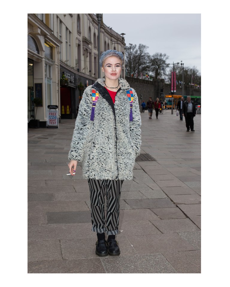
I chose this as it is one of my favourites and I think it’s both technically and aesthetically one of the strongest. I think it would start the series well, as it shows what the ideal image within this project looks like. Although Cardiff as a location isn’t obvious, to more eagle eyed audiences, Cardiff Castle is noticeable in the background which provides more context. I like the cool tone of the image, as it makes the hints of colour stand out more. The hint of red was also a main reason I chose this, as all of my final 6 have elements of red in them which makes them flow easier for the audience.
Image 2:
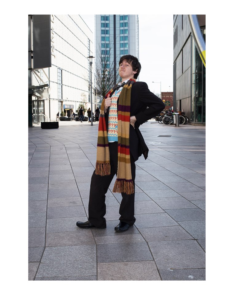
As the series started with a woman, I wanted to balance it out with a man as the second image. As well as this, this image is more vibrant and has more bold colours which creates a contrast between the first and second pictures. This photograph also introduces the audience to the background location which is seen throughout the final 20, and the final 6. The hints of red in his scarf and jumper allow the image to flow from the previous one, and onto the third.
Image 3:
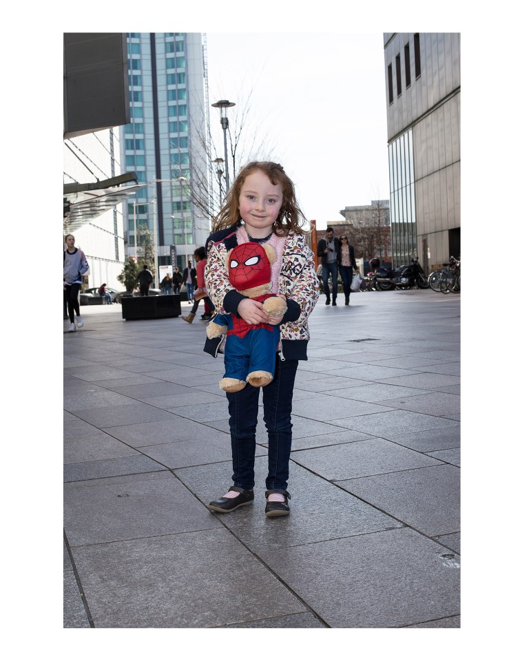
This picture was another of my favourites, and so I wanted to include it in the final 6. However, it is one of the very few successful pictures of a child that I got. I didn’t want it to look out of place, and so I thought I would include another image of a child to support it. The gender of the subject (female) helps to balance the forming pattern of the final 6, and also provides more variety in the subjects of the final 6. The background location that was introduced in the previous picture is seen again, so the audience starts to become more familiar with it. The innocence of the little girl gives the photo a more sympathetic quality that the other images in the set don’t have. Finally, the hint of red on her spider man teddy helps to continue this idea of red running throughout.
Image 4:
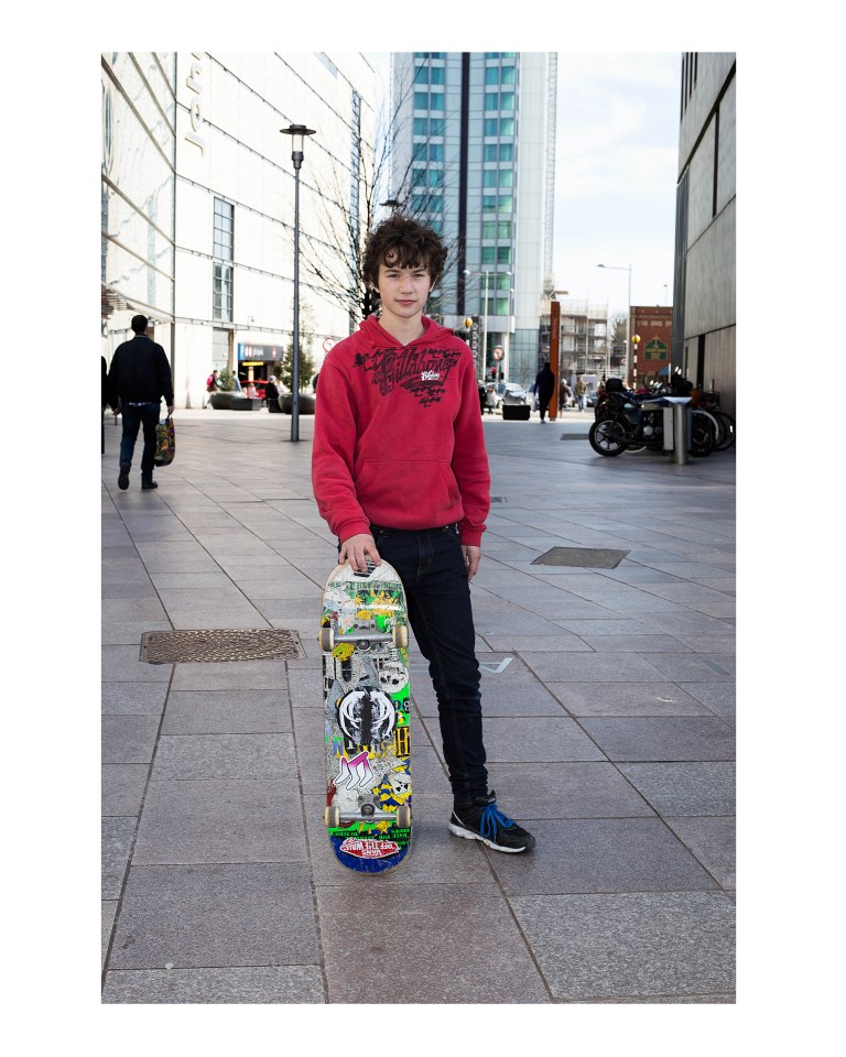
To make the previous image seem more fitting within the final 6 prints, this subject is a lot younger than the rest which keeps the two children together, and makes them both seem less out of place. The gender of the child being male again helps to fit the pattern of female to male in the set of 6, and the location is the same which provides more continuity. The prop gives the audience some information on the interest of the subject which isn’t as common in the 20 (although it’s not absent either); and again, his red jumper continues the red theme in the 6 images.
Image 5:
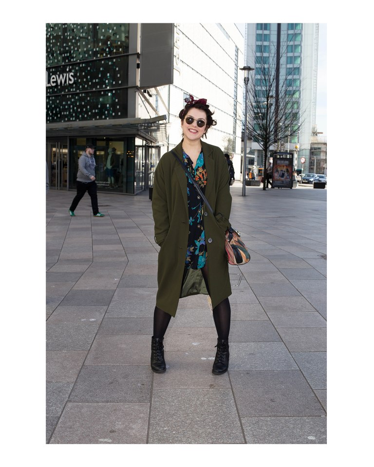
I have used another female for this to continue the pattern, and this was shot in a similar location which is evident from the tall building behind the subject. The flash has worked well at separating the subject from the background in this in my opinion and the age of the subject isn’t too significantly different from the previous image to make it look out of place within the set. The hint of red is a lot less obvious in this image than it is in others which may make the picture seem out of place. However, it is there (in her headband) and I think the framing of the picture is one of the strongest that I got in all 40 that I had to chose from, so it made it into my final 6.
Image 6:
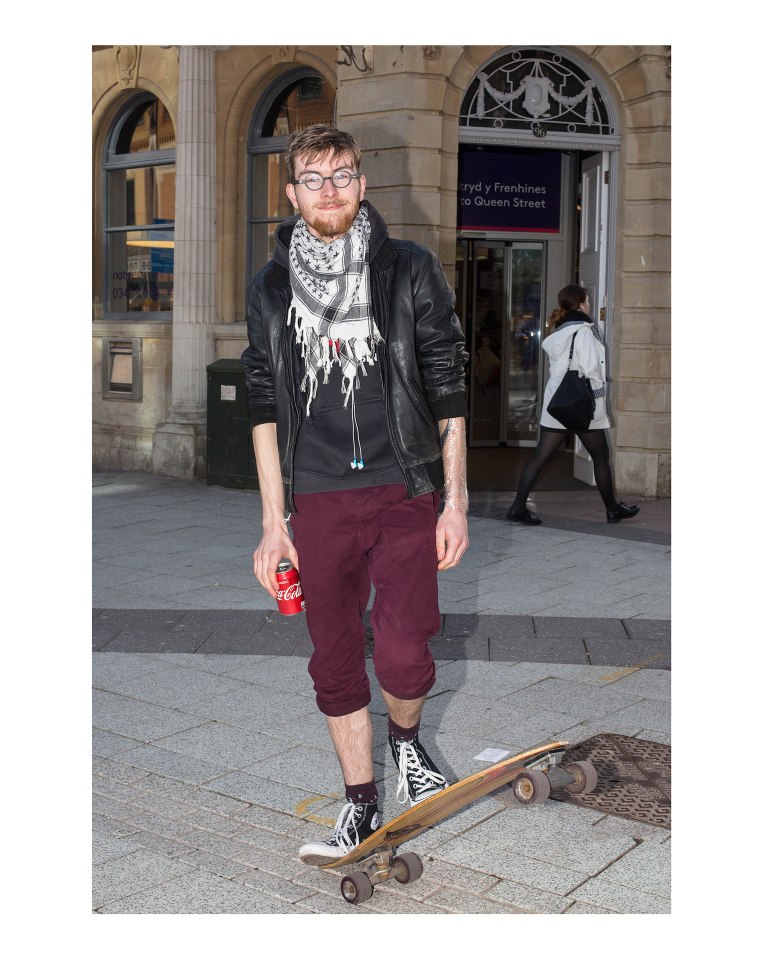
This image is the last of the final 6. I chose this for a few reasons. Firstly, the gender of the subject being male completes the female/male pattern that I formed throughout the set. The prop of a skateboard makes the image link in more with the shot of the young boy, who also has a skateboard; tying them together. Like the first image, the background is different to the others, and it’s also slightly darker. This makes the set seem like it’s gone full circle. Although the framing is slightly closer than the others, I think it still works well at allowing the audience to see the personality within the subject. Finally, the obvious red tones in his can and his trousers ties the picture in with the rest of them, and completes the series.
